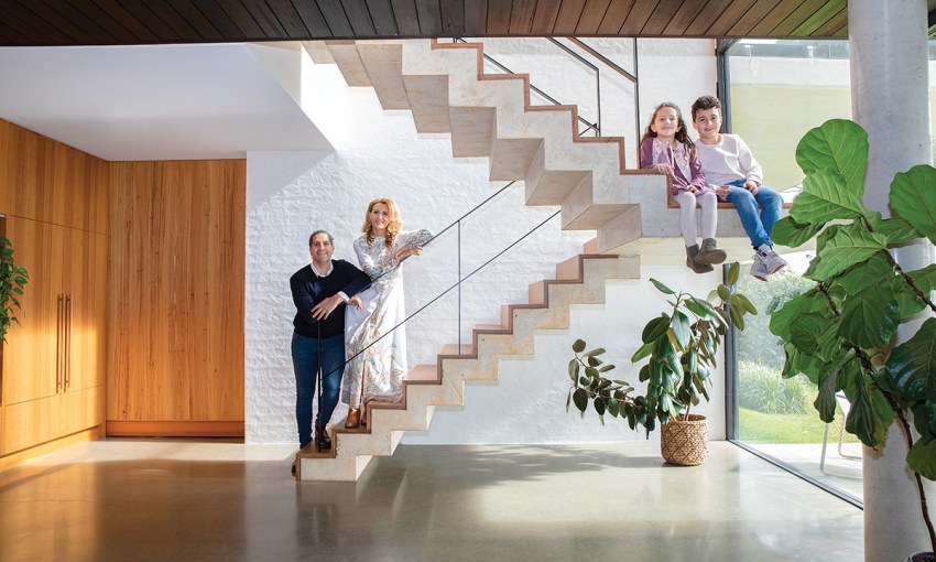
Designing a home for his own family on a large, steep block created the perfect blank canvas for architect and builder Don Iannicelli.
Organic geometry
Architect Don Iannicelli has built a career designing and constructing beautiful homes across Adelaide.
Don, who runs Glasshouse Projects, creates high-end renovations and new home builds that reflect his love of rational forms, natural materials and creating striking homes that blend with their environments. All of these features have come to life in the spectacular home he has now created for his own family in Adelaide’s southern foothills.
Don and his wife Sharon had been living in Beulah Park but were keen to move to the hills and build on a block that offered vast views and potential for Don to design their dream home.
In 2013, a 1970s home set on a sloping 2000-square-metre block hit the market and Don knew as soon as he saw it that this was the one.
“The property may have put a lot of people off because it was a bit overgrown and ridiculously steep, but I just fell in love with it,” he says.
“At the first open inspection, most people got to the top of the driveway and kept driving because the site was a bit daunting. I think a lot of people do get frightened by sites like this because of the steepness and the logistics of getting materials in and out. But, for an architect and builder, that’s my skill set – to take those challenges and turn them into opportunities to create something unique.”
The couple purchased the old home and rented it out for two years while Don went to work on the design. His aim was to build something that took advantage of the site’s size, its northerly aspect and city views, as well as a design that sat comfortably in its environment.
“There is a strong aesthetic through Belair and Blackwood and the Hills; there’s a lot of quality mid-century architecture featuring amazing stonework. So, I definitely wanted something that was going to be bold and contemporary, but also something that felt like it could have been here for a long time,” Don says.
The talented architect has achieved all that and more with the design of this warm, stylish and practical home where he and Sharon now live with their children Cruz, 9, and Arden, 6.
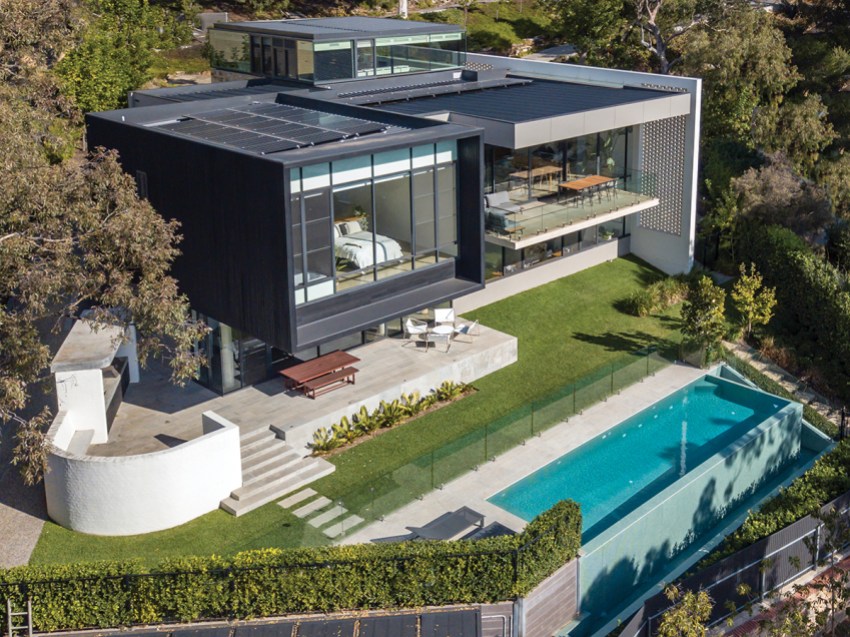
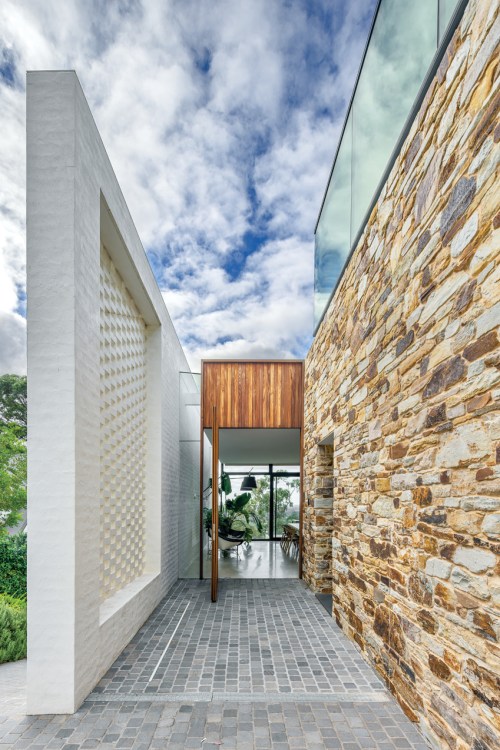
Nestled into the sloping block, the home’s first nod to the area’s mid-century aesthetic is an enormous breeze brick wall, which forms the entire western end of the home, incorporated both internally and externally into the build. At its highest point the wall is 11 metres tall and its grandeur and scale ground this enormous home into its hillside site.
A strip skylight seamlessly connects the wall to the home, providing an endless flood of natural light.
“Just after lunch, the shafts of light with shadows that fall down the strip skylight next to the wall are just beautiful,” Don says.
Original sandstone from the 1970s house was salvaged in the demolition and used to create walling for the new garage, which greets visitors at the end of the long driveway.
It was an arduous task to chip layers of caked-on sealer off the sandstone, but it was a labour of love that Don and his team were committed to. The stones have been laid meticulously and add immediate character and originality to this enticing exterior.
“It’s funny, a lot of people see the breeze brick wall and think it’s an original wall and we’ve kept it and built onto it, which I love,” Don says.
“I think the materiality of that wall plus the sandstone work nearby really nestles this home and doesn’t make it feel like it’s this ostentatious new dwelling, which I certainly didn’t want.
“We wanted a home that was wholesome and inviting and comfortable and not pretentious in any way, that’s not how we live.”
The massive three-metre-by-two-metre steel-framed front door is a construction feat in itself.
It is so heavy it had to be installed and positioned before it could be custom clad with vertical blackbutt timber panelling. There’s no handle, the door simply pivots, gently inviting you in to discover what lays beyond.
“I wanted it to feel like a wooden panel rather than a traditional door,” Don says.
“That way the entry funnels you in, giving a notion of a moveable wall.”
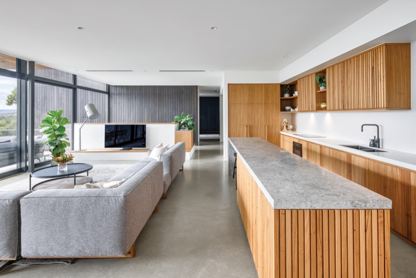
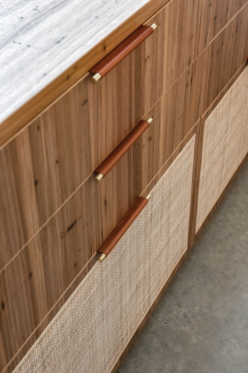
Once inside, layers of earthy natural materials reveal themselves – wormy chestnut cabinetry, blackbutt timbers, and a wall of iron ash wood which seamlessly connects inside and out.
“Iron ash wood is a native species and has a light tone but we used a triple black Cutek stain on it that gives it a nice deep colour,” Don explains.
Polished concrete floors, a five-metre limestone island bench in Portsea grey, and an Essa stone splashback in “white concrete” are all perfectly tied together with pared back, natural furnishings and interiors.
It’s clutter-free living, thanks to features such as the clever nook for blazers and school bags, and bespoke cabinetry designed especially for hiding day-to-day clutter such as phones and chargers.
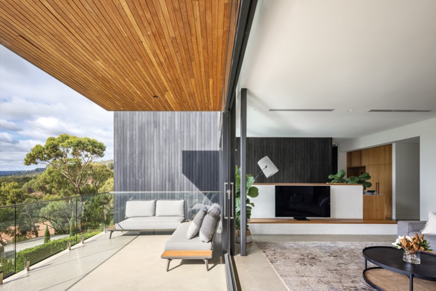
However, the real showpiece of this open-plan living space lies beyond it: those city views.
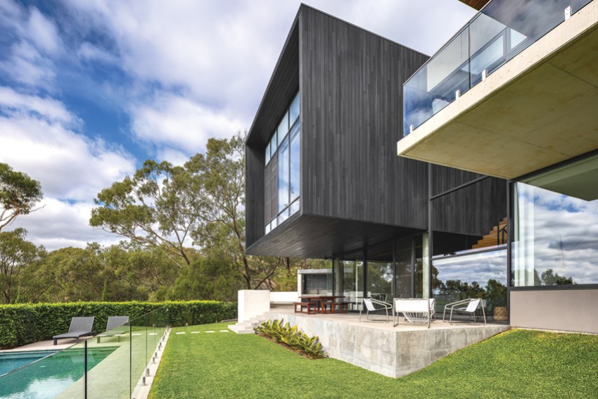
Framed by the overhanging balcony, the expansive vista creates a sense of floating above it all while still being connected.
“I think that’s what I love most about living here; I love feeling that you are not caged in,” Don says.
“I like that it doesn’t matter which room you are in you feel connected to the landscape.”
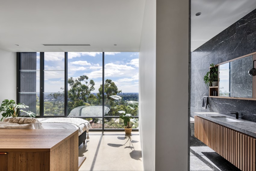
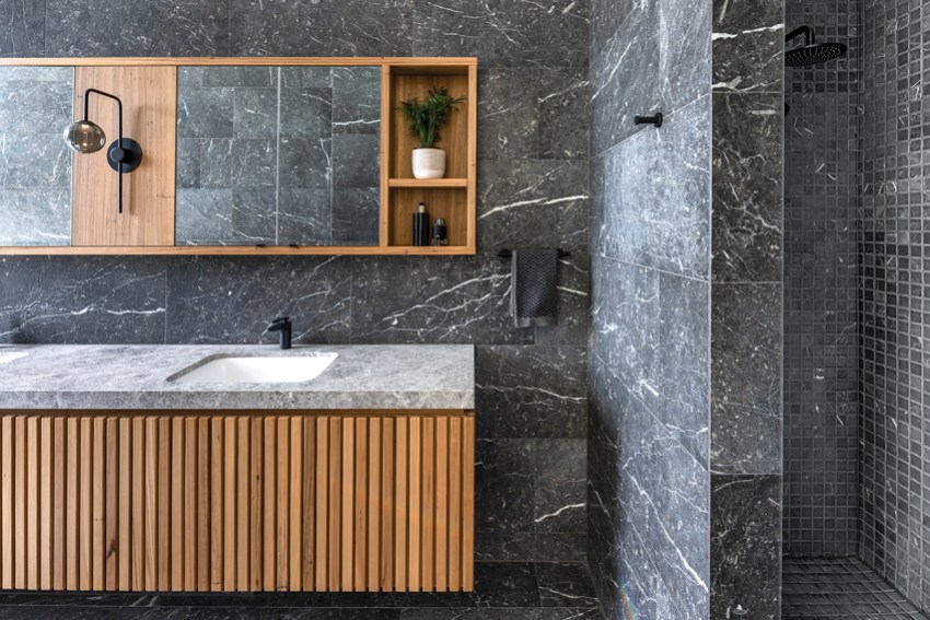
Don’s love of geometric forms comes to life in the cantilevered black box that contains the master suite, which also takes full advantage of those views with the bed facing the floor-to-ceiling windows.
“We call our bed the sun bed because on a winter’s day you lay on there and the sun is beating down on you, it’s just lovely,” Don says.
“And we have the overhang to protect us in the summer.”
The enormous walk-in robe is a clever and versatile use of space, designed with plenty of forethought. It’s connected to the living area by a huge sliding door and doubles as a play room for the children, complete with piano.
“Eventually, we will block it off but we knew the kids would want to play near us, so this is their play space. They spill out on the rug and still feel like they are with us.
The floor-to-ceiling robes are finished in statement “black Ravenna” veneer, inside and out, and feature internal lighting.
“I get up pretty early to go to site, so it’s nice not to have to switch on the lights, I can just open the cupboard and see what I need,” Don says.
“It also adds to that luxe feel.”
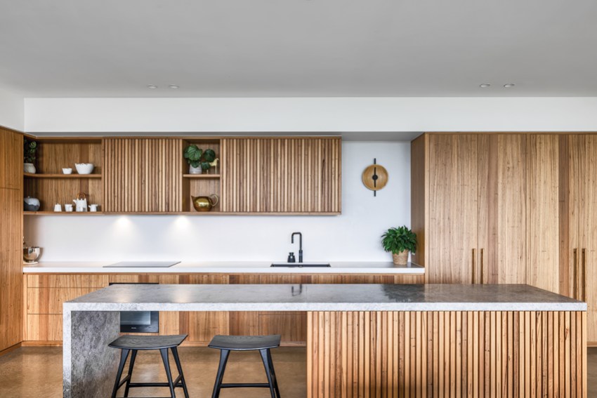
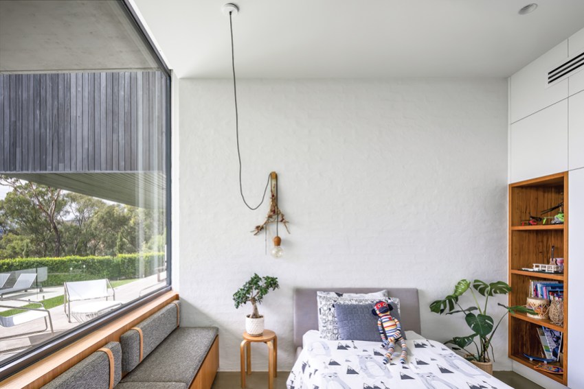
The lower floor houses the children’s bedrooms, plus a spare bedroom, an open office/play space, two bathrooms and another versatile living space that opens out to the raised entertainment area.
This open-plan entertaining area also boasts a second kitchen, which means no running up and down stairs when the family is entertaining.
“If we are entertaining around 10 to 15 people, upstairs works well and we can spill out onto the balcony,” Don says.
“But I come from a big Italian family and we can have 30 or 40 people here, so we created the multipurpose downstairs space to cater for those numbers.
“With big crowds, we push the couches back and we can fit in a few trestle tables and there’s plenty of room to spill outside onto the raised entertainment area and lawn. It works really well.”
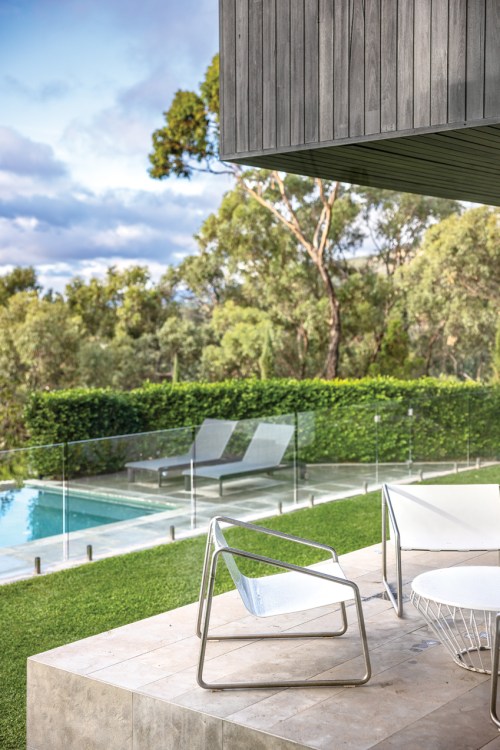
In the summer months, the stunning 11-metre infinity pool offers another great way to entertain, and Don also enjoys getting in some early-morning laps.
“The kids love the pool and they’ll get out and lay down on the sloping lawn and soak up the sun,” he says.
“It’s actually a real thrill to hear our kids say ‘We’re so lucky, we love our house’. That’s nice to hear as a dad but also as the creator of the space.
“Cruz is at the age where he was able to help throughout the build. He’d be here with me on weekends and he helped build the veggie patch, so he’s got that real connection to the place. He says he wants to be a carpenter now.”
Don started his career back in 1999, with a company that did design and construction. He then spent 10 years with Chase Crown before beginning Glasshouse Projects 13 years ago.
“When I left university, I started off in that design/construct model and I’ve always been drawn to firms who have the ability to deliver their products; that’s what I’m passionate about,” he says.
“I hate designing and then just leaving it. Don’t get me wrong, there are fantastic builders out there, but it’s really difficult as a designer to palm your babies out and just see what happens.”
A key to the success of this design is the fact that Don has used his skills to maximise the versatility and liveability of the sloping block.
The pool itself created a retaining wall, while around the pool, a hedge cleverly hides a shed for all the pool equipment, plus three hidden rainwater tanks that hold 20,000 litres of water. Don has also designed the home so that a cherry picker is able to get around the entire perimeter via paths, allowing access for maintenance to the exterior timber cladding, which needs oiling once a year, eliminating the need to set up scaffolding.
“Steep blocks can be inherently wasteful in their use of space, so part of the master planning and design of the home was really thinking about where every path was going to be, where I could plateau and where I needed retaining,” he says.
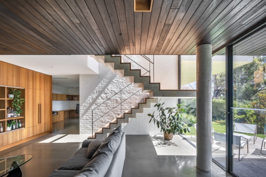
The northerly aspect of the home keeps it warm all year round and Don says they rarely need to rely on the thermostat underfloor heating.
“We also have reverse-cycle air conditioning but we don’t use if for heating, only very occasionally when we need to cool the house in the middle of a heatwave,” he says.
“Other than being comfortable and warm this is just such a practical house to entertain in. It really is all about creating a lifestyle and we just love it.”
So, is it this best house Don has ever designed?
“It’s the best house for us,” he says.
“I think that goes for pretty much anything Glasshouse designs. Architecture should be about the brief and the client, especially residential architecture. So it may not be right for someone else, but it’s perfect for us.”
This article first appeared in the Septemer 2022 issue of SALIFE magazine.


