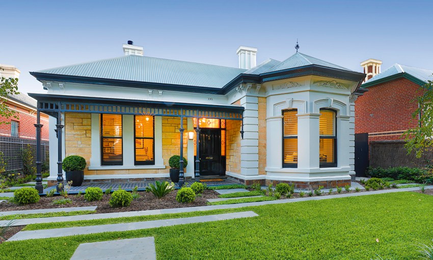
Selling high-end homes means real estate agent Sally Cameron is surrounded by luxury every day. So, the successful businesswoman had plenty of inspiration to draw on when it came to renovating her own fixer-upper in Rose Park.
Feature home: Agent for change
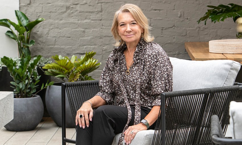
Sally Cameron had no intention of buying the run-down villa in Rose Park that she’d driven past so often. The well-known real estate agent and her family lived in a very comfortable home in Medindie where they’d been for the past 10 years.
But thoughts of downsizing had crossed Sally’s mind, so, when she and husband Peter attended the auction of the fixer-upper in 2017, they bid and bought. Just like that.
“That’s what happens at auctions,” Sally laughs. “But I was very keen on the location and I also loved the front bay window, which is spectacular.
“The house was very run down and painted mustard. I don’t think anyone could have seen what I saw. I knew that once it was painted black and white, it would come up a treat. It had the facade and the potential I was after.”
The other selling point for Sally was the home’s south-facing rear, not what most buyers are looking for. With plans for a major renovation, Sally’s vision was a home where both the heritage front and the renovated rear faced north.
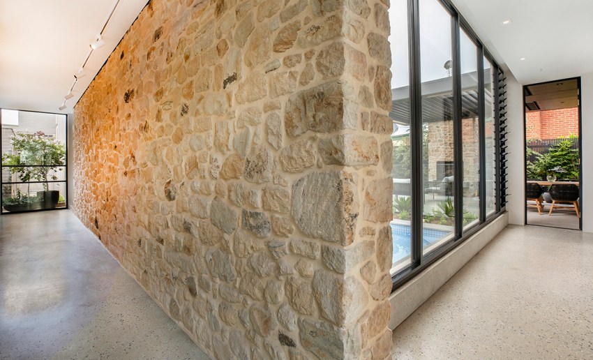
To achieve this, a long corridor, or gallery, has been designed to run along the side of the property, connecting the old and the new.
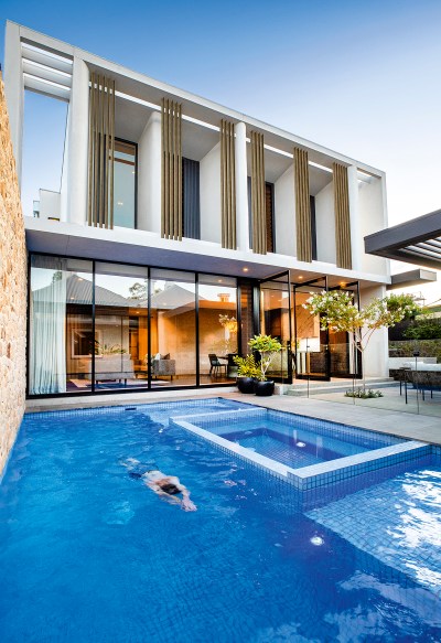
Basket Range stone walls in the gallery, similar to those of the existing house, provide continuity and give a warm, rustic feel. At the heart of the design is a central courtyard boasting a pool, spa and compact outdoor living space.
Architect David Burton and interior architect Sophia Leopardi (Williams Burton Leopardi) worked on the huge renovation project and Sophia says the Basket Range stone in the gallery “reads as a garden element inside and out”.
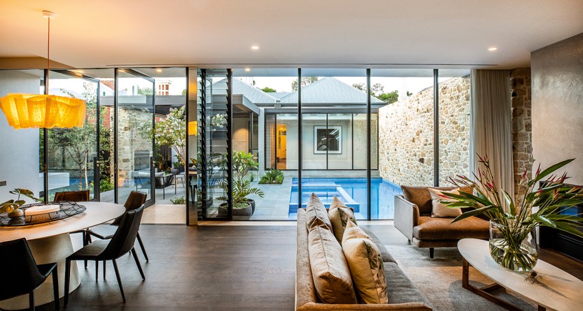
“And with big glass openings at either end, the path through the gallery is ambiguous, are you inside or outside?” Sophia says. “This was important in ensuring the two zones of the house tied together through a material experience, but were also differentiated by the ‘outside’ experience of the courtyard and the gallery.”
Sally says the floor plan works well for their family of four, including sons Joshua, 20 and Charlie, 18.
“What I wanted was all about the light. When I sell a house people say, ‘I want north facing rear’, whereas this is better because the front of the house has northern sun, as does the back. There is not a single room that doesn’t get light,” she says.
The renovation took almost three years to complete. Sally and Peter chose David Burton as they have renovated houses with him over the past 20 years.
“Keep in mind, this isn’t my first rodeo,” says Sally, who works for Toop&Toop real estate. “Also, I get to see all sorts of houses on the market through my work.
“David is very good at doing villas and I like the fact he incorporates stone, concrete, wood, metal and mirrors. I love all those different textures which he’s integrated into this build.”
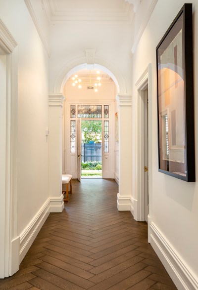
Interesting textures are evident as soon as you step into this spectacular home. An immediate standout are the Lambert & Fils Dot Atonium lights hanging in the hallway, as well as the original pressed metal on the hallway walls, which has been retained and painted.
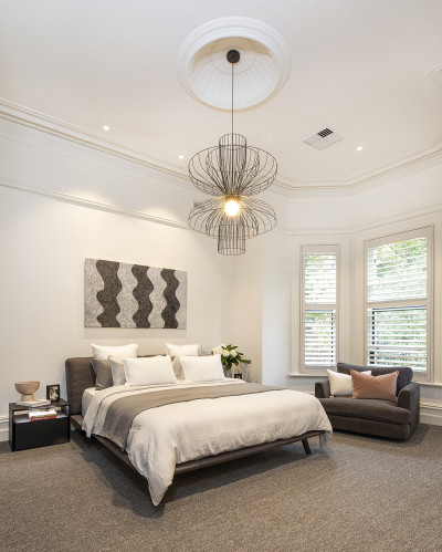
The home’s original living room, kitchen and a bedroom, which ran down one side of the property, have been transformed into an uber-stylish and enormous master suite, including a huge dressing room and luxury en suite.
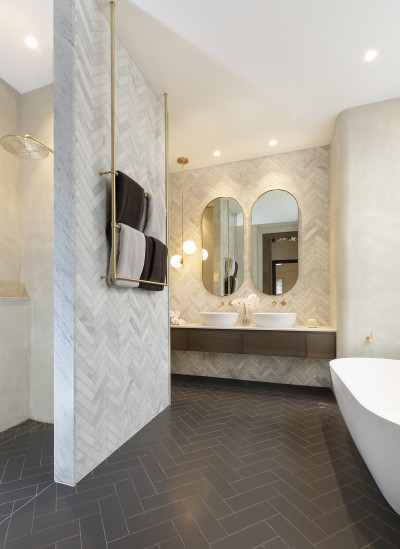
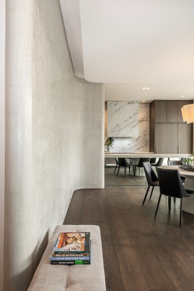
It’s clear that most aspects of this transformation are custom made, including the curved Venetian plaster walls used in various applications, such as the master en suite and the open plan living area in the addition.
“David recommended the Venetian plaster and I love it,” Sally says. “We were going to use penny round tiles in the bathroom but I thought it would look too busy and I wanted something more slimline, so we went with the plaster.”
Sophia Leopardi says the Venetian plaster “brings depth, solidity and at the same time softness”.
“It can also be used in wet areas and externally, so there’s the opportunity to bring continuity and sense of connection between spaces, inside and outside,” she says.
Originally, Sally had wanted a Hamptons-style house when it came to interiors, but things didn’t quite work out that way.
“There is nothing Hamptons about this house at all except the herringbone, a design feature dotted throughout,’ Sally says. The flooring in both the villa and new addition is French oak with a custom stain, laid in herringbone pattern in the villa and straight boards in the extension.
“Sophia designed the interiors based on my Hamptons idea and when she did the original drawings I didn’t like it all. So I said, ‘just do it as you would do it’, and I much preferred that.”
Sophia says the overall interior palette is neutral with lots of natural materials, offset with contrasting metallic accents. The house unfolds in layers of steel, stone, wood, brushed brass fittings, concrete and marble.
A clever touch is the wooden detailing used in the living room walls, applied to soften the expanse of curving Venetian plaster.
“We wanted to create some definition to this stretch of wall and tie it back to other elements within the space, so the timber felt like the right material to achieve this,” Sophia says.
Beautiful form and functionality are brought to life in this house, where luxury looms but nothing feels too precious.
Luckily, Sally is not too precious about her designer silk rug in the living area, which her beloved dogs, Missy, 17, and Bebe, 12 months, have unfortunately ruined.
“Yes, I’ve tried to get the stains out but I’ll have to get rid of it now I think,” she says.
The villa now includes a library/study where Peter works from home, trading the stock market, a guest bedroom with en suite, separate bathroom and the standout, a renovated cellar. A solid wall was knocked out and steel-framed, glass doors were installed to show off the stairs and custom hand railing, leading down to the cellar, which the previous owners used as a cinema room.
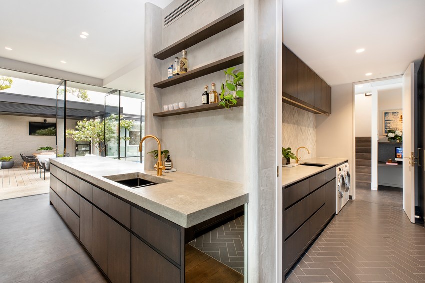
Huge steel-framed pivot doors, made by local company Steel and Smith, have also been used in the new extension, giving a dramatic effect, linking inside and out. The extension includes the kitchen and open plan living/dining area and a study nook for Sally, while off the kitchen is the combined butler’s pantry and laundry.
“It’s unusual to have it in one,” Sally says. “But you can block it off with the sliding door, and you can utilise it easily as well. Because the laundry is visible, you have to keep it clean all the time, so I’m absolutely obsessed with getting all the clothes away, whereas if you have a laundry tucked away it’s easy to just shut the door on the mess.
“I’m not naturally tidy but I have been in this house because I want to be and it’s easier. We’ve got heaps of storage and it’s just a really functional house.”
Sitting above the new living area is a “teenagers retreat” with two bedrooms, a bathroom and a well-sized living area, providing plenty of space for the couple’s sons.
Delicate metal screens, finished in Hemp Murobond Bridge paint, have been used externally on the upper level of the new build, providing privacy and softening the look. Sophia says it is one of her favourite elements of the home.
“It’s sculptural and great to look at but also functional in that it provides sun shading and at the same time screening,” she says.
This is a contemporary, stylish home built cleverly onto the 700-square-metre block.
Another of Sally’s must-haves was secure parking for four cars side by side and, with back-lane access, the new design allows for this. A door with reeded glass provides elegant yet practical access from the garage directly into the home’s new living area.
Deciding to downsize from their previous home into this smaller space was a big decision and, Sally admits, even though she doesn’t get emotionally attached to houses, it was a wrench to say goodbye to Medindie.
However, the move was timely for the couple, who admit they’ve joined the 50+ downsizers who still have adult children living at home.
“For my age group, it’s all about downsizing, but the key elements we also want are really glamorous kitchens and bathrooms, really good heating and cooling, cellars, outdoor living space and garaging. And ceiling heights, people like high ceilings,” Sally says. “So, I was ready to downsize from Medindie because I wanted really low-maintenance living that was really sleek and I also wanted every bell and whistle.”
And that’s what she got. The kitchen cabinets are a custom stained American oak, and the four-metre concrete kitchen bench was poured onsite.
When it comes to heating and cooling, the couple has installed 13-kilowatts of solar power, there are two Escea gas heaters, in the library and main living areas, three reverse cycle systems and underfloor heating in the laundry, toilets and bathrooms.
Outdoor highlights include the Louvretec opening pergola with rain sensor, to protect outdoor furniture, and the solar heated magnesium pool and spa. Sally says she’s been in the spa every day since the family moved in earlier this year.
And her favourite feature of all is her V-ZUG oven and steam oven.
“I sold a house for a guy who now owns Samuel James Homes and he used to own JAG Kitchens and he said get Swiss brand V-ZUG and they are the best things I got,” she says. “The steam oven is amazing. I don’t use a microwave, even to defrost things, it’s all steam. It also does dry steam so it will toast a sandwich. I’m no cook but I love it, it’s the best appliance I’ve ever had.”
Of course, all this custom-made opulence means the couple spent double their original budget, which Sally is hesitant to reveal.
“But people need to understand if you want quality you really do have to pay for it,” she says. “So, there is a difference between an architectural home and a packaged or kit home, it’s very different, because everything is custom made, every benchtop, wall, fitting.”
The house, which was constructed by Ikon Projects, is liveable, versatile and low-maintenance, including the garden.
“I wanted to make sure we had enough garden for it to be a feature, because we don’t have much land, but I still really like the idea of gardening,” Sally says. “It’s mainly down the side and at the front of the house, so it’s all on show.
“But I’ve made it all irrigated, so we can go overseas and leave it and it will be fine when we get back. Even the pots on the verandah can be turned on when you are away.
“The usability of this house is fantastic. It’s easy to clean, it’s easy to keep hot and cold and really cost-effective, and you can lock and leave.
“This house could easily suit two people but you could also have a family with three children.”
The location, in walking distance to Victoria Park and the cafe strip of Hutt Street, was another selling point for the savvy couple.
“Rose Park is seen as one of the go-to locations within Adelaide because it offers really pretty villas and easy walking to everywhere,” Sally says.
“We’re very happy here, and we love how this home has been transformed, but that’s not to say it’s our forever home. Who knows?”
This story first appeared in the June 2020 issue of SALIFE magazine.


